I came across this infographic while researching a picture book character I was developing. I was so saddened by the reality of who is and isn't represented. I learn through visuals, so the use of the mirrors held by the characters in proportion to their story representation was a great device. Big thanks to David Huyck for creating such a valuable image and to Sarah Park Dahlen and Molly Beth Griffin for bringing this image to light. My hope is that this image will continue to circulate and eventually sit in the subconscious of writers and illustrators as they ask themselves, "...and what is my character like?"
Mini Interviews - David Ezra Stein
There are just some books that resonate with you on so many levels...
Interrupting Chicken
by David Ezra Stein is just one of those books. I have read this book and reread this book to my kids so many times and with each time the volume level gets louder. The fighting also increases on who gets to be "Interrupting Chicken". How could a book about the telling of quiet bedtime fairy tales from a Papa Chicken to his daughter lead to such uncontrolled chaos? I'm partly to blame because I love it so much and have a hard time restraining my enthusiasm.
I'm also beyond enthusiastic presenting to you David's answers for the latest Mini Interview.
Please describe your career as an author-illustrator in 5 words:
Injecting fresh air into books.
Which books, that were your favorite when you were little, have had the greatest influence on your work?
Hmm….I have been influenced by everything interesting I've ever seen. But here are a few: Dr. Seuss books, for love of language and wonky world design. Calvin & Hobbes, for its philosophical perspective, sophisticated silliness, and dynamic drawings. Tintin comics, for bright colors, colorful characters, and international adventure. And so many more books, commercials, movies, TV shows, textiles, paintings, and musicals.
Please share an instance in which you had an idea or experience that started out small, but took root and grew to become a book.One of my latest books, Ol' Mama Squirrel, was a combination of a squirrel scolding me in the park near my house, and the Occupy movement being in the news. Squirrel protecting her babies + outraged activists = picture book? It does if you're me.
Do you ever hide little images, names or personal details in your illustrations?
Please give us a peek...
In my 2012 book, Because Amelia Smiled, I was able to put lots of people I know in as extras. My children's book illustration teacher, Pat Cummings, is seated in the subway scene, at the right hand side, looking at the viewer. My sister and her husband are walking a dog outside in the pizzeria scene, which also features my son's face on the soda machine. My son is also in Ol' Mama Squirrel, which is dedicated to him.
Daily routines are important for both writers and illustrators. Could you describe your typical work day, and tell us the one little thing you absolutely cannot begin your day without (besides caffeine)?
There's not a lot typical about my days. I feel like I'm always trying to manage my creativity better. It's a full-time job to provide outlets for all my inspirations and interests. I'm constantly trying new schedules to harness the day in a more productive way.
I do like to write and storyboard in my local cafe, where I have written and sketched out all of my 11 books. Then I end up in the studio for making my finished art. One thing I almost never skip is Morning Pages, which I got into by reading The Artist's Way by Julia Cameron. It's part of the spiritual practice of being an artist.
Tomie dePaola once told me that Ben Shahn told him that being an artist isn't what you do, it's how you live your life. So I tend to see it that way as well: an ongoing daily practice that is punctuated by published works.
Being an admitted "space cadet" do you find that state of mind helpful or harmful to completing a book? (from one space cadet to another)
I would not be able to listen to my inner voice and honor it if I didn't have the power of daydreaming. It's essential to me. Winnie-the-Pooh called it a "hummy" sort of feeling when he was getting an idea. That's how I experience it as well.
On the flip side, when a deadline comes along I have to be a professional. I have to sit down and work even when I don't feel like it. Sometimes I even have to do a book idea I am not crazy about, and I have to find a way to become crazy about it.
As a young child, David started out drawing on Post-It note pads his mother, an editor, left around the house. An admitted “space cadet,” he showed an early knack for daydreaming and doodling. His parents and grandparents read him lots of books, which fed his imagination and became a touchstone for his love of imagery and storytelling later in life. David went on to become a voracious reader and made up stories of his own. Near the end of his time at Parsons School of Design in Manhattan, encouraged by beloved author and teacher Pat Cummings, he decided to pursue children’s books as a career. After graduation, he was briefly a window display artist, puppeteer and puppet builder, interior and set-design illustrator, and New Yorker cartoonist. In 2006, his first book,Cowboy Ned & Andy, was published by Simon & Schuster. Since then he has published eleven picture books. David lives in Kew Gardens, NY with wife, Miriam, and son, Sam. When he’s not working on new stories and pictures, he enjoys making music, cooking, running, hiking, and talking with kids and grown-ups about books!
If you'd like to see more of David's work make sure to check out his site and Facebook page!
If you can't get enough of this talent, make sure to check out David's latest book Dinosaur Kisses!
Mini Interview: Sean Qualls
The first time I came in contact with the work of Sean Qualls was during SCBWI's summer conference in 2011 where Art Director for Simon & Schuster Books for Young Readers Laurent Linn explained the process of directing artists through the many twists and turns of picture book illustration. I learned two things from the presentation:
1. Laurent Linn's job seemed too large and overwhelming for my little mind to comprehend.
2. When Laurent Linn showed us the work of Sean Qualls, I immediately scribbled his name down and circled it repeatedly. His work was so rich in texture and had such graphic shapes, I couldn't resist it.
Not only is Sean gifted in illustration but also as an upcoming author/illustrator! He has been so kind as to share his process in my first "Mini-Interview".
Please describe your career as an author-illustrator in 5 words:
Work, work, play, play, work.
Which books, that were your favorite when you were little, have had the greatest influence on your work? In terms of themes, Golden's illustrated Bible for Children and D'aulaires Book of Greek Mythology. As for art, I like the comic book art of Bill Sienkiwicz.
Please share an instance in which you had an idea or experience that started out small, but took root and grew to become a book.
My first book as author/artist (pub date to be determined.) A while ago I did a color sketch of a jazz singer. I kept it on my art table for a long time. My agent helped me to create a manuscript based on that sketch.
Do you ever hide little images, names or personal details in your illustrations? Please give us a peek...
In the beginning of Dizzy there's a scene where Dizzy is being bullied by two other boys. Since that was a reality for me when I was a kid I used the name of street I grew up on in the art.
Often times I'll use my home as inspiration for interior scenes. For instance, I used my kids room in the opening pages of Lullaby. Sometimes a self-portrait may show up.
Daily routines are important for both writers and illustrators. Could you describe your typical work day, and tell us the one little thing you absolutely cannot begin your day without (besides caffeine)?
After getting my kids off to school, I spend some time (usually in cafes) journaling/self reflecting. I also use that time to figure out what projects to spend my time on that day/week. Green tea is my drink of choice.
Your work seems to have a definite love of texture and color-do you build up abstract layers until you feel you've achieved the right color/texture combination for that particular illustration?
Yes. It can be a very fulfilling process getting the color and texture just right - other times more challenging. Recently, I've been changing my approach at least for some of my work. I'm always trying to find new ways to keep making art fun and interesting. Most of the art I love combines a strong graphic sensibility mixed with abstraction and textural elements.
Sean Qualls is an award winning, Brooklyn-based, children’s book illustrator, artist and author. He has illustrated a number of celebrated books for children, including Giant Steps to Change The World by Spike Lee and Tonya Lewis-Lee, Little Cloud and Lady Wind by Toni Morrison and her son Slade and Before John Was a Jazz Giant, for which he received a Coretta Scott King Illustration Honor. Sean also created the art for Dizzy by Jonah Winter and most recently Freedom Song (The Story of Henry “Box” Brown) by Sally Walker. His work has received two Blue Ribbon citations from the Bulletin of the Center for Children’s Books where he was also cited for his “serious craftsmanship” and an “original style.” Qualls has created illustrations for magazines, newspapers, and advertisements. His work has been shown in galleries in New York and across the country. Sean draws inspiration from an array of influences such as movies, television, childhood memories, aging and decaying surfaces, architecture, old buildings, nature, folk art, fairy tales, Americana, black memorabilia, outsider art, cave paintings, collectibles, African art, golden books, vintage advertisement graphics, psychology, mythology, science fiction, music, and literature. He lives in lives in Brooklyn (where you can find him DJing on occasion) with his wife, illustrator/author Selina Alko and their two children Ginger and Isaiah.
Make sure to see even more beautiful illustrations at his site: http://seanqualls.com/
Facebook: https://www.facebook.com/SeanQuallsArtist
Instagram: http://instagram.com/sean_qualls
A Mini-Interview with Kent Culotta
You know how there are some illustrations that you look at and all you can think is, "Wow, that looks like that was fun to do!" That's what comes to mind when I look at Kent Culotta's work. It just looks fun - quirky, cheerful and full of life. It was no surprise to learn when he so graciously agreed to let me interrogate him that he has his background in animation. When I found that out, it just made sense. Animators are just FUN people. Thankfully Kent has taken to picture books so we get to enjoy his exuberant images in our own time.
About Kent
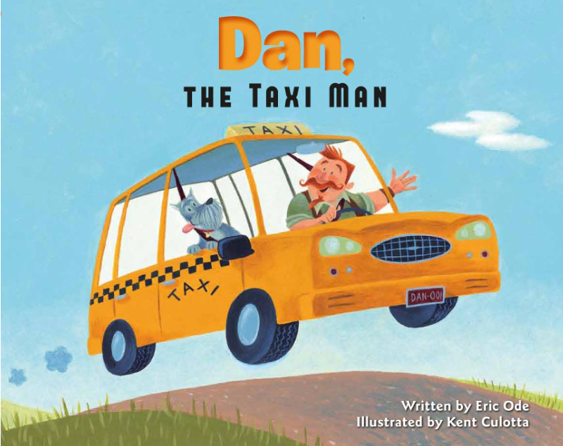
Kent Culotta was born in Detroit, Michigan and grew up nearby in Plymouth. He attended Michigan State University, where he received a B.F.A. in graphic design, and then spent a year at UCLA, where he studied animation and film. He got his first job in animation at Filmation Studios, where he worked on Pinocchio and the Emperor of the Night, and then went on to work at many studios on many films, including Who Framed Roger Rabbit, The Little Mermaid, Beauty and the Beast, The Pagemaster, Prince of Egypt, El Dorado, The Ant Bully and Ice Age 3. Kent recently illustrated his first book, Dan, the Taxi Man, written by Eric Ode and published by Kane Miller.
Describe yourself in five words:
creative, daydreamer, sheepish, persnickety, and silly.
Now, please tell us how you got started in picture book illustration (in more than five words)...
Well, I think I’ve always been interested in being a picture book illustrator; it just took me a while to get there. I did declare at the age of nine that I was going be an author and illustrator. Then I got “sidetracked” into my related interest: animation. Over the years I would take illustration classes, attend SCBWI events, etc. Finally I decided to take the plunge and started sending out postcards of my work to publishers. I didn’t hear anything right away, but about a year and a half and a few more postcards later I received an e-mail from Kane Miller asking if I would be interested in illustrating a manuscript they had. Of course I was! I did have to go through a bit of an audition process with the main character, Dan, the Taxi Man, but once I got a design that they liked, I was off and running.
If you had to describe your work in terms of your artistic influences, you would say it is...
Gosh, I don’t even know where to start. There are a lot of artists that I love and that have been influential with me, probably starting with Walt Disney. (I was a total Disney geek as a kid.) I love early 20th century illustrators, especially J.C. Leyendecker, N.C. Wyeth and Norman Rockwell. (A little six degrees of separation trivia: my great-grandfather was at one time Norman Rockwell’s dentist!) Other painters of that period I really enjoy are Edward Hopper, Grant Wood and Charles Burchfield. Comic strips from the same time period, like Polly and her Pals and Gasoline Alley. More recently I’ve become fascinated by mid century artist/designers like Mary Blair, Jim Flora and Alec Steinweiss. One contemporary artist who totally speaks to me is the cartoonist Seth.
Of the six fundamentals of 2D design (line, shape, volume, perspective, shading, and color):
a. Which is your greatest strength? My greatest strength, that’s a hard one to answer. I guess I would have to say shape, although having worked in animation I have a pretty strong grasp of line too. (Maybe a too strong grasp at times!) On the other hand I’ve really been enjoying working with color lately and feel like I have developed a rather distinctive way with it.
b.Which poses your greatest challenge? My greatest difficulty is, easily, perspective. Working so long in animation, my main focus has been in drawing characters. Having to design and paint settings involving a lot of perspective to put those characters into freaks me out sometimes.
Given that illustration is different than many day to day jobs, how do you manage your time and maintain a daily routine?
This is a challenge for me since I still do a lot of freelance animation work. Sometimes I have to put my personal artwork to the side and it can be hard getting back to it. I find that having deadlines is the best way for me to keep on track, even if the deadlines are often self-imposed.
What’s the best piece of career advice you’ve been given as an illustrator?
Just keep putting yourself out there, and don’t let fear/self-doubt get in your way.
What new projects have you got coming down the pike?
I have a couple of ideas that I’m working on right now. One is a picture book about a famous composer, and the other is based on a verbal game my brother and I used to play.
Was this always your dream job? If you could do anything else, what would it be? (Sorry! Trick two part question!)
Always is such an infinite word! I would say this has often been my dream job. (All right, I’ll admit it, I used to dream about being in animation too. Been there, …) If I could do anything else, I would love to be a composer/lyricist for a Broadway musical. Or a set designer. Or a costume designer. Or…
While I let Kent finish that thought, I urge you to check out Kent's debut book Dan, the Taxi Man. After that, make sure to stop by this website to see even more amazing illustrations, then get breaking news coverage on what Kent is up to on his blog But if you can't get enough Kent you can always reach him on his facebook page.


