The amazing and talented illustrators:
Starting Tuesday, you're going to have to check out each blog to see who interviews who!
The amazing and talented illustrators:
Starting Tuesday, you're going to have to check out each blog to see who interviews who!
 An illustration I got to do for the extremely cute and well designed magazine LMNOP. It was a great assignment, the focus being on libraries and books. Since I frequent the library almost as much as a 13 year old frequents You Tube, I've come up with some observations. Namely being the noise level. Libraries are just so cool now-with crafty interactive a-la Melissa and Doug puzzle/castles/installations. There are toys. EVERYWHERE. Puppets, blocks, swirly things that I thought existed only in dentist offices. And the trains. Kids go into mini-seizures when there is new Fergus, Benedict, Rutger (whatever) train on the train table. Sprinkled and tucked amidst the playtime chaos are the books. Books just laying around, asking to be read. "That kid take your puppet? Forget-about-it...Read me instead", "Hey! Hey! Little girl with the tiara! I'm the new Tangled book!" I think that the librarians love the noise (to a certain decibel) because kids are developing an association between libraries and fun. It's probably in some Library Manifesto to put up "quiet" signs, merely just for show.
 I got the opportunity to work recently with the magazine that without question had the largest influence on my desire to become an illustrator. Grade school memories would be incomplete if I were not able to recall the days coming home from school, checking the mail and the surge of joy that followed when receiving the latest copy of "Cricket Magazine". This magazine was a tiny folded and stapled trove of illustrations. I would devour it within a few hours, examining every page. Even into 7th grade, I would sneak my favorite copies into art class with me, completely ignoring the required assignment and copy the illustrations from "Cricket". These illustrations would of course later become illuminated manuscripts recounting the events of the day with witty 13 year old aphorisms such as "SOOOOOOOOOOOOOOOOOOOOOOOOO LAME!" and "BBB!!!!!!" (bored beyond belief) and then thus folded in the intricate 7th-grade-girl-origami-note style. I could never master the "heart" fold.
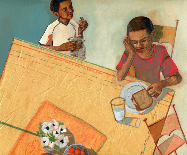
This illustration will unfortunately not accompany me to pass off to my friend Lashawn while she waits outside the band room but thanks to the amazing AD Suzanne Beck will be featured in Cricket's other imprint magazine, "Spider" in January.